Understanding the problem
Despite having strong discounts and deals, users weren’t able to fully benefit from them. The Offers and Coupons experience was cluttered, inconsistent, and hard to understand, with unclear distinctions between offers and coupons, confusing “collect” flows, and overwhelming information on high-traffic pages. This led to missed savings, lower trust, and drop-offs during checkout.
Goals
The project aimed to simplify, clarify, and personalize the Offers & Coupons experience to:
Increase conversion rate (CVR) by improving clarity of savings and simplifying redemption.
Drive premiumisation by helping users unlock the best offers without friction.
Enhance trust and transparency in how discounts are communicated.
Boost discoverability and adoption of coupons and offers across PDP and Cart.
Reduce cognitive load through better hierarchy, fewer but higher-quality coupons, and clear CTAs.
This required collaboration across Design, Product, Engineering, Brand Management, and Business teams to align on communication standards, information hierarchy, and coupon constructs.
What users had to say
We conducted in-depth research to understand users’ perception and behaviour around coupons and offers. Following were the insights:

Confusion around terminology — Users couldn’t tell how offers differed from coupons, or how each impacted final pricing.
Hard to comprehend — Many users didn’t understand “collect” functionality and dropped off when the path to eligibility wasn’t clear.
Mismatch in expectations — Users felt disappointed when they saw attractive offers that didn’t apply to their cart.
No clear feedback or guidance when an offer failed to apply or when offers got removed due to changes in cart.
Overwhelming volume of coupons led to decision paralysis during major sales.
Lack of consistency between discount amounts shown on product pages and cart hurt credibility.
Unclear savings breakdown in the final cart summary made users doubt their total benefit.
Simplified coupon and offer cards
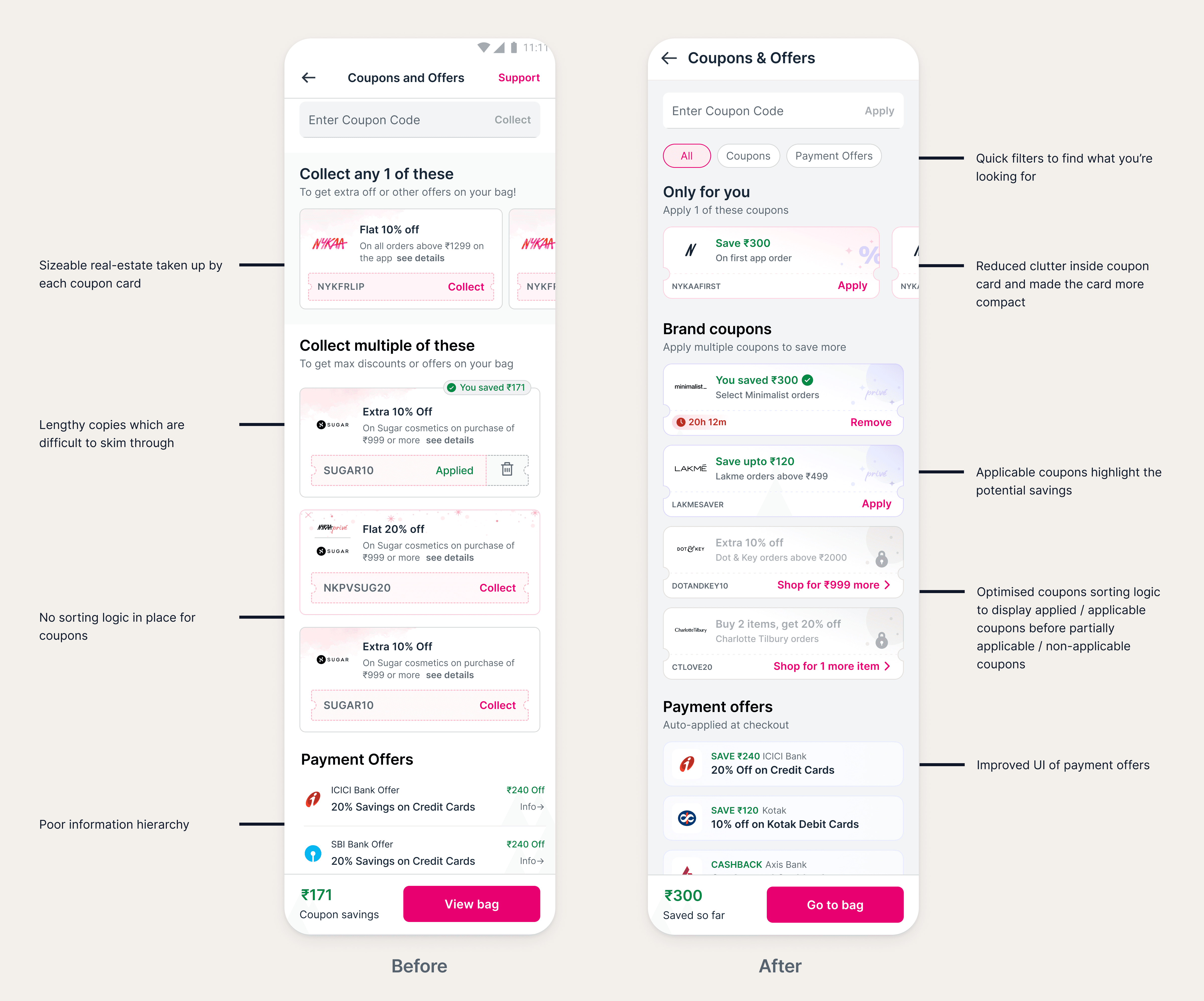
We reduced visual clutter and whitespace to make coupon and offer cards easier to scan, especially on cognitively heavy pages like PDP and Cart. The confusing “Collect” functionality was removed, replaced by two clear actions — Apply (to directly apply a coupon) and Shop for more (when user has not met the coupon condition). Titles and subtitles were simplified and standardised for consistency. An expiry timer was also added to create a sense of urgency when a coupon was nearing expiration.

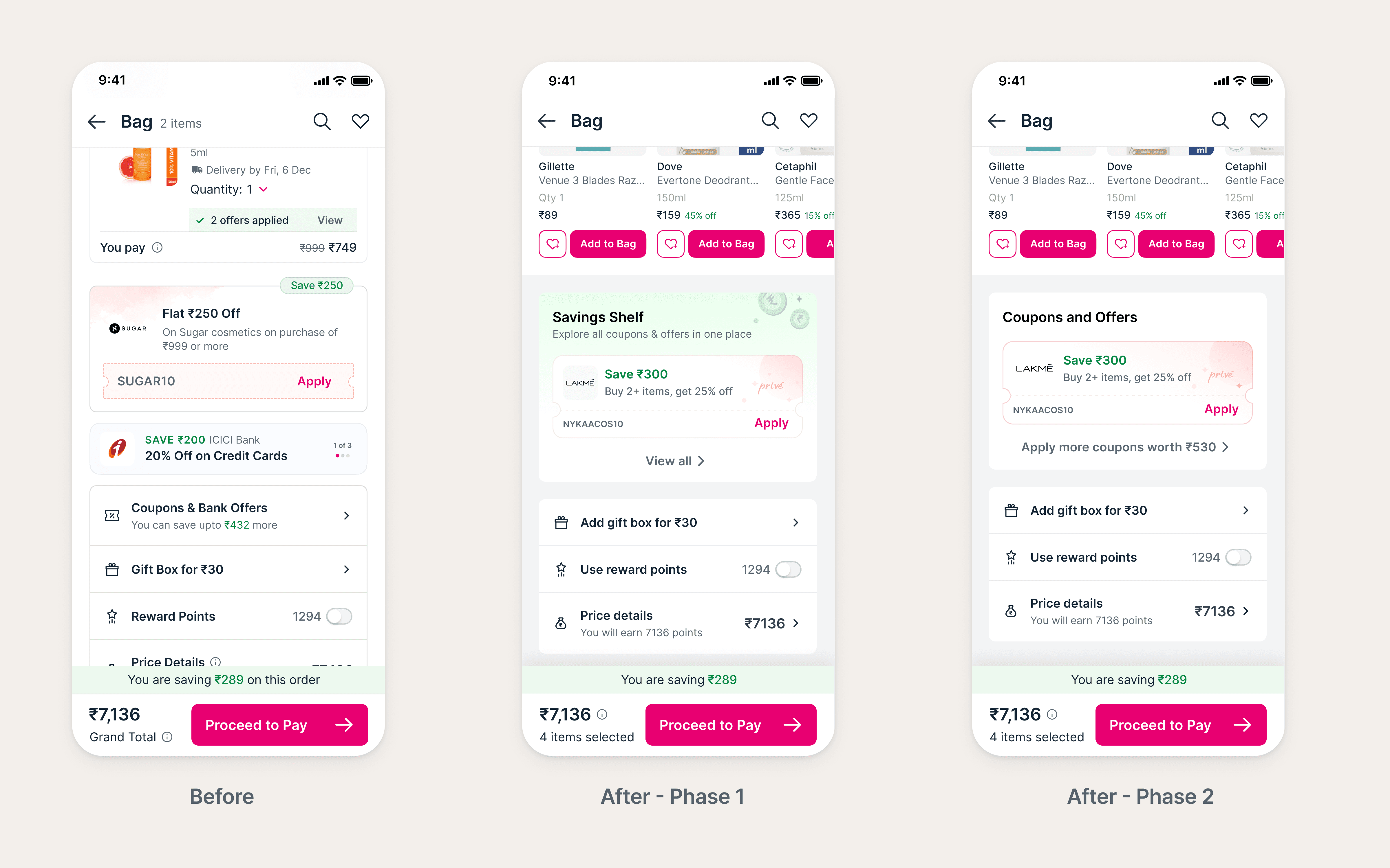
Savings Shelf — a revamped coupons section on cart
The Cart experience was redesigned to include a dedicated “Savings Shelf” that highlights the best applicable coupon upfront. A clear CTA to “View More Coupons” helps users discover additional savings opportunities, while delta messaging communicates how much more they could save. Once all coupons are applied, the section displays the total savings achieved — making the benefit instantly clear and gratifying.
Coupons page redesign
The Coupons page was restructured to improve discovery and comprehension. Top-level filters were added for quick access, and the layout was optimised to reduce scroll depth since this page had multiple brand coupons. Coupons are now organised into two sections: Only for You (Nykaa-funded) and Brand Coupons (brand-funded) — allowing users to easily differentiate and apply what’s relevant. The new sorting logic on this page prioritises Applied and Applicable coupons, displays Partially Applicable and Non-Applicable coupons in a greyed out state giving users a transparent view of eligibility.
Clearer communication and personalisation
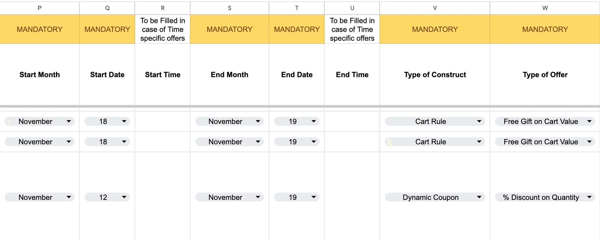
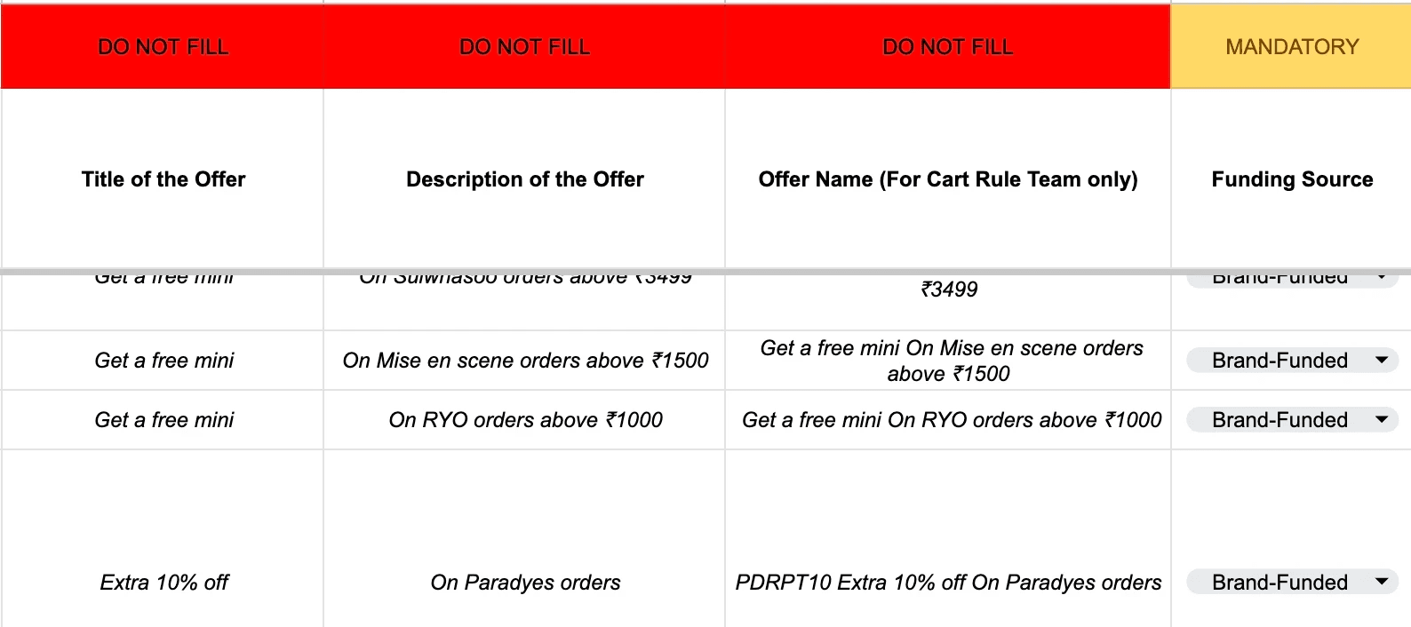
We focused on simplifying all coupon communication to make it easier to understand at a glance. Terms and conditions were rewritten in plain language, coupon copy was standardised across platforms, and sorting logic was improved to surface the most relevant deals first. The number of active coupons was curated to reduce cognitive load, supported by continuous quality check and bug bashing to maintain communication quality and consistency. This task required partnering with Marketing and Cart Backend teams to create offer/coupon request sheet that automates copies based on manual inputs.
Content guidelines based on different offer types
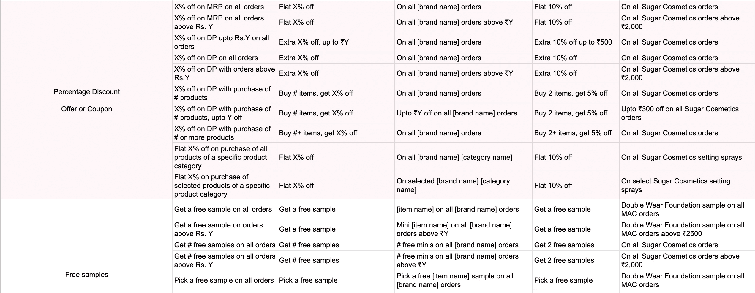
A sheet filled by 100+ brand managers that automates content based on inputs provided
Impact
Redesigning coupons discovery and application improved conversion (+2 bps), Average Order Value (+₹13.8), and revenue per visit (+₹0.93), unlocking ₹102 Cr incremental annual recurring revenue after 100% rollout.

