
Defining the challenge
The existing checkout flow required users to go through multiple steps such as verifying the address, selecting a payment method, and confirming payment, which created unnecessary friction and longer completion times.
Goals
The goal was to create a faster, more seamless checkout experience that leverages user data intelligently. On the business front, the feature aimed to improve checkout-to-order conversion, reduce drop-offs, and drive repeat purchases through convenience. We drew inspiration from competitors to validate effective UI/UX decisions.
Competitor research
A comparative study of Swiggy, Amazon, Zomato, and Apple Pay highlighted a clear visual rhythm with bold primary CTAs, minimal cognitive load, and upfront clarity on payment method and delivery address. Each interface used micro-animations or subtle gestures to make checkout feel instant and intuitive.

Phase 1
We leveraged the competitor patterns to design a clear, scalable Express Checkout UI that highlighted preselected address and payment details. Multiple iterations accounted for edge cases like auto-applied payment offers, CVV not required messaging for saved cards, and alert for COD fees before launching the MVP.

Phase 2
Post-launch data showed users were cancelling orders soon after payment, indicating they weren’t absorbing key details. To address this, we refined the information hierarchy and added a slider animation (similar to Swiggy) to the CTA to reinforce that this was the final step before the order gets placed.
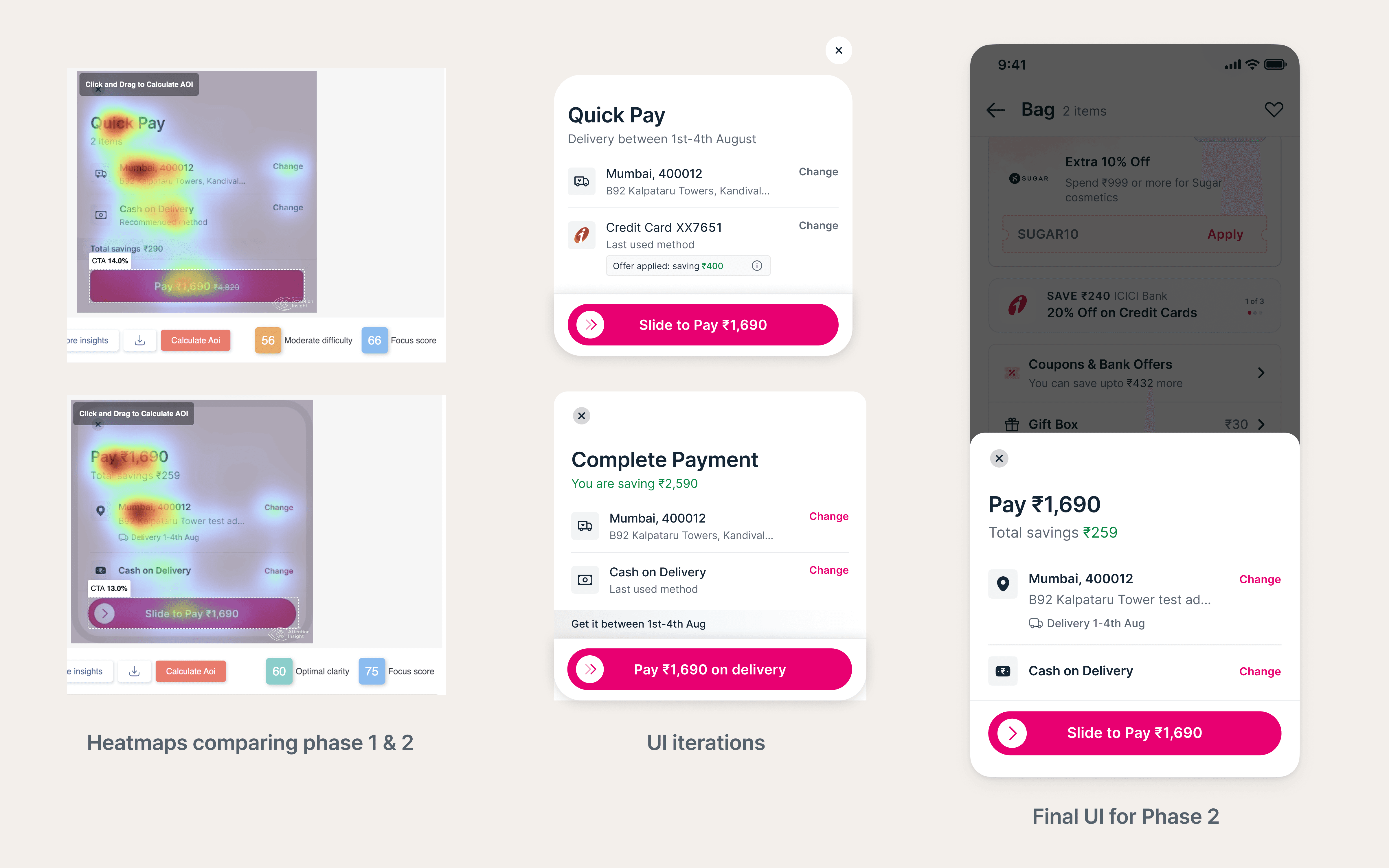
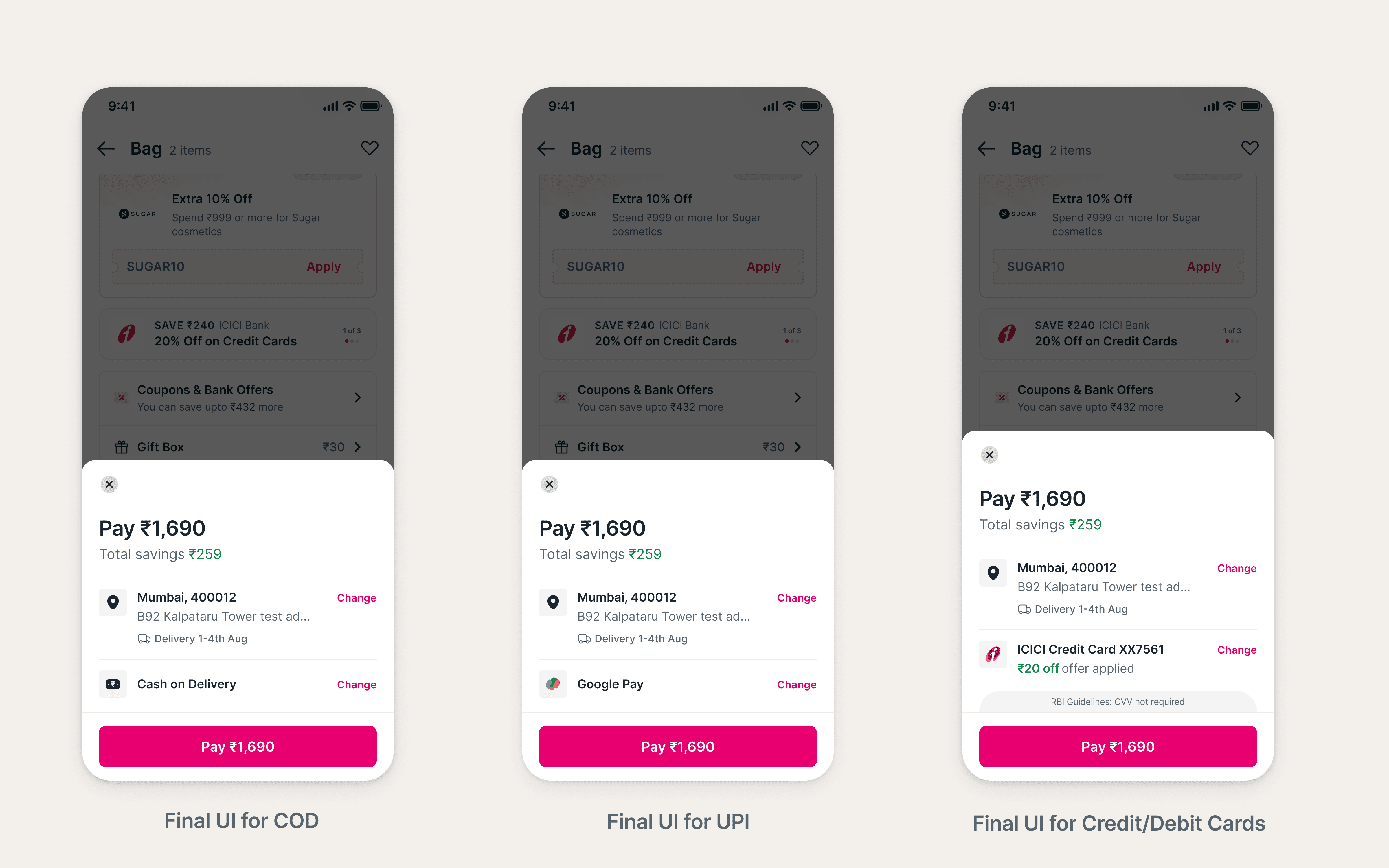
Final Live Version
We combined the best of both phases, keeping the improved hierarchy from Phase 2 and the static CTA from Phase 1. This delivered a faster, more confident one-click checkout experience that was rolled out to all users.
Impact
The final design led to an 80 bps increase in checkout-to-order conversion among repeat users, validating that a faster yet reassuring checkout experience drives better results. The feature’s annualised revenue impact is estimated at approximately ₹48 crore.
Learnings
We assumed the slider animation would perform well based on competitor research, but it reduced clarity instead. It was a reminder that even familiar interactions need validation in context and that good design decisions come from observing real user behaviour, not just following common practices.
